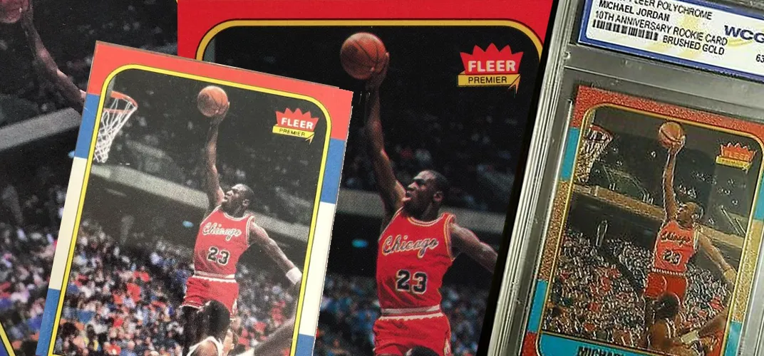
Spotting a Fake: The Collector’s Guide to Authenticating the Michael Jordan Rookie Card
Paper Stock & Print Quality
When you're holding what could be a Michael Jordan rookie card in your hand—especially the iconic 1986 Fleer—your first instinct might be to look at the player image or team logo. But real collectors know the battle is often won or lost in the paper stock and print quality. It's the foundation of the card, and no matter how advanced the forgery, fakes tend to fall apart under scrutiny here.
Let’s talk about the paper stock first. The authentic 1986 Fleer Jordan rookie is printed on relatively stiff, high-quality cardstock with a smooth front and a slightly rougher, matte-textured back. When you flex it gently between your fingers, you’ll notice it has a bit of snap—firm but not brittle. Fakes often get this wrong in both directions. Some are too flimsy, like something run through a home inkjet printer. Others are unnaturally stiff and plasticky, trying too hard to feel “premium” and instead coming across like laminated play cards.
The weight is also important. While you won’t always be carrying a scale, experienced collectors can often feel the difference. Real Jordan rookies have a certain heft, and you’ll notice it if you compare them side-by-side with other cards from the same 1986 Fleer set (which is a good trick, by the way—compare your MJ to a common like Spud Webb or Jeff Malone). Many fakes weigh too little, and some modern forgeries, especially those created using digital reprints, go the opposite way and are a touch too heavy.
Then there's the surface print. The original Fleer cards were printed using traditional offset printing methods, which leaves very tiny, almost undetectable rosette or dot patterns in the ink—especially noticeable in areas of solid color. With a jeweler’s loupe or magnifying glass, you should be able to see the distinct, clean rosette pattern on a real card. Many fakes, particularly laser-printed or inkjet reproductions, will have muddier print textures. If the print looks overly smooth, pixelated, or even has visible horizontal ink lines (like you'd see from a cheap printer), it’s an instant red flag.
Look at the borders too. The red, white, and blue color blocks on real 1986 Fleer cards are printed with clean transitions and even saturation. The red on a fake might be too bright or dark, or it may bleed into the white. It’s subtle, but once you’ve seen a few authentic copies, it becomes easier to catch. On real cards, the edges where colors meet are sharp—no bleeding, no blurring.
Some fakes also suffer from poor registration. That means the layers of color printing are misaligned, which can cause a ghosting effect or make lines and text look fuzzy. Check the black outlines of text or the image. They should be crisp and clean. If things look off-center or wobbly, it’s a problem.
Don’t forget the back of the card either. The print is softer there, but still clean. On a real Jordan rookie, the red Fleer logo and blue stats table should be vibrant but not overly glossy or shiny. Fake backs often have colors that pop too hard because they’re printed with modern ink formulas on incorrect stock. Sometimes they’re too dull, like a photocopy left out in the sun. Either way, it’s wrong.
And here's the thing—print technology has come a long way, but ironically, that works against counterfeiters. Today's printers just don’t mimic 1980s offset printing well, and most aren't trying to. They rely on fooling people who don’t check this kind of thing. If you're ever unsure, always compare the suspect card side-by-side with a known genuine Fleer card from the same year. Print and paper don’t lie. Everything else might be on point, but if the card stock is wrong, the card is wrong. Period.
Centering & Edges
If you've ever been deep in the hobby trenches, you know how much weight grading companies place on centering and edges. But when it comes to spotting fakes—especially of the 1986 Fleer Jordan rookie—these features do more than affect value; they can help you call out a counterfeit before you even get to the microscope.
Let’s start with centering. One of the defining quirks of the '86 Fleer set is how notoriously bad the centering was, even straight from the factory. It’s a known trait, almost a personality of the set. You’ll often find top-to-bottom centering slightly off, with the bottom border fatter than the top. Left-to-right centering was often inconsistent too, sometimes shifting the card's image to one side or the other. In short, perfect centering is rare—but it’s real. The important detail is this: while the centering may be off, it still follows a consistent factory-cut pattern.
That’s where fakes mess up. Many modern counterfeits are built from digital scans of perfectly centered PSA 10s. They replicate the clean, crisp appearance of a mint card, but ironically, that perfection becomes the red flag. If you’re looking at a raw MJ rookie with absolutely perfect centering, no variance in borders, no natural print shift, and it’s being offered by someone without a solid reputation—it should raise an eyebrow. A well-centered Jordan is valuable, yes—but too good to be true often is exactly that.
Now to the edges—this is where the story really starts to fall apart for counterfeiters. Authentic 1986 Fleer cards were cut using a factory process that left a fairly smooth edge, but under magnification or just with experience, you’ll notice a slightly fibrous, almost frayed texture, especially on the back. The cut isn’t laser-sharp like modern printing equipment would produce. You might even see a touch of white chipping, which is common and doesn’t necessarily lower the value much unless it's extreme.
Fake edges usually fall into one of two categories: too clean or too messy. Cards made with modern digital printing and cut with home trimmers or guillotine blades often leave edges that are too crisp and perfect—again, ironically giving them away. Others use scissors or poor-quality cutters that leave obvious jagged marks. Run your finger carefully along the edge of the card—real ones feel factory-cut and subtly textured. Fakes can feel either rough like paper that was torn rather than cut, or unnaturally smooth like it came from a modern photo lab.
Pay attention to corner roundness as well. The 1986 Fleer cards didn’t come out with perfect radius corners. Authentic cards often show slight variation in corner shape—something very hard to fake convincingly. When cards are trimmed to try to fix damage or fit them into a case, they often get a tell-tale unnatural roundness or even too tight of a corner arc. Some are even hand-trimmed with tools that leave behind micro-indents or pressure marks—another dead giveaway under close inspection or magnification.
Another trick: turn the card on its side under a light and look at the edge for layering. The original cardstock has a distinctive layered look—especially visible from the side. If the edge looks too uniform or glossy from the side, it could be printed on incorrect material or a sticker printed and pasted onto blank cardboard, a common technique with low-effort fakes.
And here’s one last trick that only comes with handling lots of these: the “snap test.” You don’t need to damage a card to do this. Just hold it between your thumb and index finger and gently flick or flex it. Real ones have a slight snap when bent and released. Fakes, especially those on cheap stock or reprinted photo paper, won’t respond the same way. It's subtle—but real collectors feel it.
So if you’ve got a possible Jordan rookie in your hands, don’t just look at the front and back—run your eyes and fingers along every edge. Check the centering, compare border widths, look at how the light hits the corners. These aren't just cosmetic traits—they're historical fingerprints from a 1986 printing press. And fakes? They rarely get those details right.
Color Matching & Ink Saturation
Color is a funny thing. To most people, red is red, blue is blue, and unless it's wildly off, they don’t notice the subtle differences. But if you’ve ever studied a genuine 1986 Fleer Michael Jordan rookie card—or better yet, held a few—you start to realize just how specific the coloring really is. The red, white, and blue border isn’t just patriotic flair—it’s a signature, and getting it wrong is one of the most common and revealing mistakes counterfeiters make.
Let’s talk about the red border first. On authentic Jordan rookies, the red isn’t neon or lipstick-bright. It’s a deep, slightly muted red, with a soft matte appearance—not glossy, not loud. Some fakes go overboard here. They crank up the saturation and print a red that almost glows under light. It pops unnaturally, especially when compared to a genuine copy. That’s a classic mistake from digital printing, where color profiles are optimized for screen or modern paper rather than mimicking 1980s print chemistry.
The blue section is another giveaway. The real card uses a medium blue—something between royal and navy, with even distribution and no bleeding into the white frame above it. A common trait in fakes is oversaturation in the blue, sometimes to the point where it almost looks purple or electric. It might be subtle at first glance, but side-by-side with a real card, you’ll spot it immediately. Worse fakes sometimes go the other way and print a washed-out, dusty blue with uneven ink application.
The yellow “BULLS” text in the upper-left corner is surprisingly tricky for counterfeiters too. On a legit copy, it’s printed in a bold, saturated yellow that contrasts well with the red border. It’s not orange-leaning and it’s not mustard-like. Many fakes either under-saturate the yellow so it looks pale and sickly, or they overdo it and make it look like it came out of a highlighter.
Now, this is where ink saturation really comes into play. Real 1986 Fleer cards were printed using offset lithography—a method that applies ink in layers using printing plates. This creates a smooth and even distribution of ink with slight texture visible under magnification (rosette patterns, which we’ll get into in the next section). The saturation is even, balanced, and clean. On fake cards, especially ones made with modern printers or reprint kits, ink tends to pool or streak slightly in solid color areas. It’s not always obvious to the naked eye, but once you know where to look—corners, borders, the nameplate—you start seeing the smudges, the bleeds, the inconsistencies.
Look closely at Michael Jordan’s jersey in the photo. On an authentic rookie card, the red and black pinstripes on the Bulls uniform are defined and the red matches the border tone—slightly muted but rich. On a fake, the red of the jersey can appear too bright or inconsistent with the rest of the card. Sometimes the facial tone is wrong, too—either too warm, too orange, or lacking the grainy quality of the original photo.
Also important: the text on the front. “MICHAEL JORDAN” and “GUARD” at the bottom should be in a sharp, ink-rich black that doesn’t shine under light. If the text looks faded, shiny, or the ink appears to have spread (called feathering), it's a red flag. Ink bleed around the letters is especially common in cheap reproductions that can’t match the precision of the original press.
One of the best tricks is simply comparing your card to known real ones. Grab high-res scans of PSA or BGS authenticated cards—not just eBay listings—and put them side-by-side. Zoom in on colors, check saturation in the borders, and see if anything just feels off. Your eyes can’t always quantify what’s wrong, but your gut usually knows.
And if you’re in doubt, check how the colors react under light. Authentic cards tend to absorb light with a soft matte finish. Fakes, especially glossy reprints, reflect light differently—more like photo paper or plastic. That reflectivity is unnatural for a 1986 card and another subtle indicator you’re not dealing with the real thing.
Bottom line—color and saturation aren’t just about aesthetics. They’re the fingerprints of a printing process frozen in time. If your Jordan rookie doesn’t look like it came out of 1986, there’s a good chance it didn’t.
The Dot Pattern Test (Print Rosettes)
If you're serious about detecting fake Michael Jordan rookie cards, especially the classic 1986 Fleer, there’s one trick that separates amateurs from seasoned collectors: the dot pattern test. Also called the rosette pattern test, this method dives into how the card was originally printed—and it’s nearly impossible to fake perfectly.
Let’s rewind a bit. Back in 1986, Fleer used offset lithography, a printing method that transfers ink from a plate to a rubber sheet and then onto the card stock. This method produces recognizable, repeating dot patterns, especially in areas of solid color or in photo details like faces, uniforms, and background gradients. These dots aren’t random—they’re called rosettes because they form little flower-like circular patterns when magnified. They're extremely fine, precise, and uniform in genuine cards.
You’re not going to see these with the naked eye. What you need is a jeweler’s loupe (10x or 20x magnification works great) or a decent USB microscope. When you zoom in on the colored areas of an authentic 1986 Fleer MJ rookie—say, his face or the red portion of his jersey—you’ll see these tiny rosette patterns made up of cyan, magenta, yellow, and black ink dots (CMYK). It’s subtle, but the dots have a consistent size and spacing that real printing presses produce effortlessly—and that home printers or digital fakes simply cannot replicate.
Fakes typically fall apart under magnification. Cards produced with modern inkjet or laser printers won’t show a clean rosette pattern at all. Instead, they’ll either have a grainy, random dot pattern (often from inkjet printing), or pixel-like blocks or streaks (if laser-printed). These patterns may look sharp from afar, but up close, they appear scattered, too smooth, or just too chaotic.
Try this: pick a spot on the card with color gradients—like MJ’s arm or the shadow under his chin. On a real card, you’ll notice the shading is made of clean dots that blend into one another. On a fake, shading will often look like it was applied with an airbrush tool in Photoshop or a low-quality printer. There’s no clean transition, and the pattern might look cloudy or fuzzy.
Even some higher-end forgeries, which are scanned from authentic cards and then reprinted on better cardstock, still fail the rosette test. That’s because scanning a rosette pattern and printing it again doesn’t reproduce the original—what you get instead is a moiré pattern, which looks like weird waves or overlapping lines. That happens when one dot pattern interferes with another during the scanning/printing process. If you ever see swirls or weird rippling textures under magnification, that’s a huge red flag.
Another place the rosette test works wonders is the background of the card—the area behind Jordan in the image. On a real one, even though it looks like a plain stadium or crowd blur, those colors were still printed using offset litho and contain tiny dots of varying colors that blend together. Fakes often smooth this area out or print it with much lower resolution.
Same goes for the yellow “BULLS” text, the white player name bar, and even the red/blue border areas. In all of these spots, rosettes will appear where ink coverage isn’t 100% solid—especially in mid-tones. You just won’t see that same level of detail and structure in a fake.
Here’s a good collector’s trick: keep a common 1986 Fleer card handy—any player will do. Use your loupe on that card and then compare it directly to your Jordan. If you see a clear rosette pattern on the common card and something different on the Jordan, that’s suspicious. Because the same printing process was used for every card in the set, there should be no difference.
And here’s the kicker: counterfeiters can do a lot of things. They can mimic design, fake edges, even replicate old cardstock pretty well. But reproducing a proper rosette pattern with the correct ink and mechanical printing pressure? That’s a whole different level of difficulty. Most fakes simply aren’t even trying to get that right. And that’s why this test is one of the most reliable tools in your arsenal.
Font & Stat Table Details
Most people focus all their attention on the front of a Michael Jordan rookie card. It’s flashy, it’s iconic, and it’s where the money’s at, right? True—but if you really want to weed out a fake, you’ve got to flip it over. The back of the card, specifically the font and stat table layout, holds a goldmine of clues that forgers consistently mess up. You just have to know where to look.
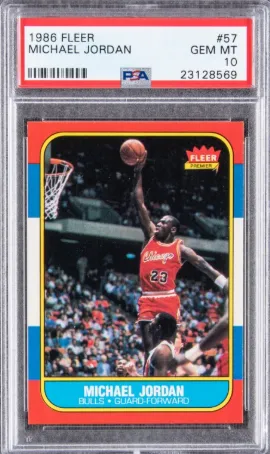
Start with the basics: the card number. The real 1986 Fleer Jordan rookie is card #57, and it’s located in the top right corner on the back in bold black font inside a white circle. On authentic copies, that “57” is printed cleanly and evenly centered in the circle. The font has a specific thickness—not too thick, not too light—and the edges of the numbers are crisp, with no feathering or blur. Fakes sometimes get this wrong by using incorrect fonts, slightly wrong sizes, or poor printing methods that make the numbers look fuzzy, thick, or misaligned inside the circle.
Next, move down to the player bio line, which is found directly under Jordan’s name. This line should read:
Height: 6’6” Weight: 195 College: North Carolina
On real cards, that text is sharply printed in a thin, sans-serif font that is consistent across the entire 1986 Fleer set. You’ll notice precise spacing between words, even alignment, and no bleeding of the ink. Many counterfeits mess this up because they either retype the font (and pick the wrong one) or scan from low-res sources where the small text gets distorted. Common issues in fakes include incorrect quotation marks around the height (real ones use curved “smart quotes,” not straight ones), misaligned text, or characters that look slightly too bold or compressed.
Now let’s talk about the stat table, which is probably the most telling part of the back. It features a two-row chart with Jordan’s 1984-85 rookie season stats and career totals. The rows are labeled “84-85 BULLS” and “NBA TOTALS.” The columns show G (Games), FG% (Field Goal %), FT% (Free Throw %), Rebounds, Assists, Steals, Blocks, and Points.
On authentic cards, every number in that stat table is aligned perfectly in its column, printed in a very narrow, uniform font. Fakes almost always botch this in one of two ways:
- Font mismatch – They use a modern font that’s close but not quite right. On fake cards, you might notice numbers that are too bold, too spaced out, or just slightly off in shape. A real 3 doesn’t look like an 8, and a real 1 doesn’t have extra footers or flourishes.
- Misalignment – The spacing between columns is extremely precise on real cards. The numbers should line up vertically from row to row. In fakes, the “NBA TOTALS” line might be nudged to the left, or individual stats might appear slightly off-kilter—like someone pasted them in one at a time rather than printing them from a single typeset layout.
Take a close look at the red Fleer logo at the bottom left of the card, too. The letters should be sharp and evenly spaced inside the oval badge. Some fakes will have the oval too tall or short, or the font inside will look off. The word “Fleer” should never look stretched or pixelated.
Now check the copyright line at the very bottom. It reads:
© 1986 FLEER CORP. PHILA., PA. 19141 PRINTED IN U.S.A.
On authentic cards, the text is tiny but very crisp and legible, even under magnification. The font is uniform, not wavy or jagged. Poor reproductions often use a blurry scan or a retyped version that ends up too thick, misaligned, or even missing punctuation. Also—don’t forget that the period after “U.S.A.” must be there. Some forgeries leave it off.
Another underrated thing to check? The spacing and padding between each section on the back of the card. There’s a consistent vertical gap between the stat table and the Fleer logo, and between the bio and the stats. These white spaces should be uniform. When fake cards are assembled from different source materials—maybe a scan of a front and a separate scan of a back—those gaps can be too large, too small, or shifted altogether.
As always, your best bet is a side-by-side comparison. Get a common 1986 Fleer card (someone like Danny Ainge or Thurl Bailey) and look at the font spacing, alignment, and layout. It should match the Jordan card exactly, because the same templates and print runs were used across the entire set. If it doesn’t match, you’re not looking at a real Fleer print—simple as that.
So while the front gets all the glory, the back of a real MJ rookie card is like a fingerprint. Forgers try to copy it, but something always slips through the cracks—be it a bad font, a wonky alignment, or a misprinted number. The devil is in the details, and on the back of a Jordan rookie, those details speak volumes.
UV & Gloss Testing
There’s something almost invisible about real authentication work—literally. One of the most underrated and underused techniques when evaluating a potential fake Michael Jordan rookie card is checking how it reacts to UV light and examining its gloss pattern. While this method won’t tell you everything on its own, it’s a great way to catch red flags early—especially if you’re looking at a raw card in person.
Let’s start with the UV light test. Real 1986 Fleer cards react in a very specific way under ultraviolet (black) light. Under UV, an authentic Jordan rookie does not glow bright white. Instead, it should appear relatively muted, often giving off a dull gray or slightly bluish hue, depending on the batch and wear of the card. That’s because the paper stock used in the 1980s wasn’t treated with optical brighteners the way many modern printing papers are.
Many fakes—especially reprints done on standard white photo paper or with modern digital printers—glow intensely under UV. The whites light up like a flashlight, and even areas that are normally matte will bounce back a strong fluorescent response. It’s a huge giveaway. If you shine a blacklight over a suspected card and it starts glowing unnaturally, you’re probably holding a modern reprint or a counterfeit made with contemporary materials.
Also, check the borders and card back under UV. Real cards will often show faint signs of age—slight yellowing, uneven response to UV due to oxidation over time, or consistent dullness throughout. Fakes, especially those printed on freshly bleached stock, will appear too even, too white, and too perfect. That perfection is the red flag.
Now let’s get into gloss.
The front of an authentic Fleer Jordan rookie has a specific type of semi-gloss finish. It’s not high-gloss like a modern Chrome card, and it’s not completely matte like some older vintage issues. Instead, it has a very mild, slightly smooth finish—just enough to give a hint of reflection in the light, but not enough to produce a mirror shine. This semi-gloss was a result of the coating used by Fleer during the printing process in the mid-'80s. It protects the card surface without overdoing the sheen.
Fakes mess this up constantly. Some are printed on photo paper, which has way too much gloss. Others have a completely flat, dry finish that feels like copier paper. Worse yet, there are laminated reprints that look and feel almost like stickers—they shine too bright, feel slick to the touch, and reflect light in a way that screams “modern printer.”
You can test gloss by slowly tilting the card under a soft light—like a lamp or even sunlight near a window. On a real card, you should notice a gentle reflection as the light moves across the surface. It shouldn't be sharp or wet-looking, and the gloss should be consistent across the front. If the light catches oddly—highlighting texture inconsistencies, bumps, or overly glossy patches—that's a concern.
Another good trick is to lightly rub a fingertip across the card's front. On a real Jordan rookie, the surface will feel smooth but not slippery. There’s a subtle drag from the semi-gloss coating. Fakes can go in either direction: either too slick, with no friction at all, or too rough, like untreated paper.
Some fakes also fall apart under slight surface pressure. Try gently tapping the card with a fingernail. An authentic card will respond with a firm, muted tap. A card printed on poor stock may sound “papery” or even hollow. This isn’t a lab test, of course—but after handling a few dozen real cards, you start to develop a feel for how they should behave.
One more note: real 1986 Fleer cards rarely show obvious print or gloss "layering" when viewed from the side. Some modern fakes, especially those printed in layers (ink, gloss, laminate), will show artificial separation at the card’s edge when viewed closely under light. If you spot multiple material layers or strange edge reflections, that’s another red flag.
Gloss and UV testing are particularly useful because they’re hard to fake on demand. A scammer can scan and print a nice-looking image, but they can’t easily replicate the exact way a 1986 Fleer reacts to light or touch. These are properties that come from the original materials and manufacturing—not just design.
So if you’ve got a blacklight handy and a good light source, use them. Shine it. Tilt it. Touch it. Let the card speak for itself, and trust that a real MJ rookie will show its age in all the right ways.
Slabbed Card & Grading Label Forgeries
For a long time, buying a slabbed Michael Jordan rookie card felt like a safe bet. PSA, BGS, SGC—once that card was sealed in a tamper-evident case with an official label, it was considered legit. But as the value of a 1986 Fleer Jordan skyrocketed into the five and six-figure range, counterfeiters stepped up their game. Now, it’s not just the card that’s getting faked—it’s the entire slab.
It’s a disturbing shift in the hobby. Scammers know people are more likely to trust a card inside a reputable grading company’s plastic case, especially if it’s labeled PSA 10 or BGS 9.5. Unfortunately, that trust is exactly what they’re preying on. And while the grading companies have taken steps to stay ahead, some fakes are shockingly good—until you know what to look for.
Let’s start with the slab itself. Real PSA and BGS holders are made of high-quality, tamper-evident plastic with consistent seams, weight, and clarity. On a real PSA case, you’ll notice the smooth edges, uniform thickness, and clean ultrasonic weld seal around the card. The logo is etched or embossed, depending on the generation of the case, and there’s zero distortion when viewing the card through the plastic.
Fakes often miss the mark on case quality. Some use cheaper plastic that flexes too much or feels brittle. The seams might be poorly welded, with slight bubbling or uneven texture. Others are repurposed slabs—real cases cracked open, emptied, and resealed with fakes inside. These can be especially tricky, so attention to detail matters.
Now let’s talk labels—this is where most slab forgeries fall apart.
On a genuine PSA label, the font is crisp, perfectly aligned, and printed on high-quality stock. There’s a subtle micro-pattern in the background of newer labels (a security feature) and a holographic foil logo at the bottom of the label or embedded in the slab depending on the generation. Older PSA slabs don’t have the same level of security, but even those have clean printing and label positioning. The barcode and certification number are always printed evenly, and when scanned or entered into PSA’s database, they should match the card exactly.
That’s a good trick: verify the cert. Go to PSA’s website, plug in the cert number on the label. Does it match the card’s grade, year, and description? If not, it’s fake. Some scammers steal legit cert numbers and print labels that look almost identical—except the card inside doesn’t match the cert details. Even worse, some use fake cert numbers that don’t exist at all.
BGS slabs are even trickier because they include subgrades. But again, the key is alignment and clarity. On a real BGS label, subgrades are perfectly spaced and sharply printed. The font is specific—bold for the header, light for the subgrades—and the gold or silver background is metallic, not just printed yellow or gray. Fakes often mess this up. Look for any blur, misalignment, or font that looks too thick or off-center. Check the back of the slab too—BGS uses a distinct embossed logo that should be centered and clean.
Also—check for frosting. Both PSA and BGS use a sonic welding process that leaves slight frost marks at the weld points. These aren’t always dramatic, but if the slab is perfectly clear from every angle, especially around the seams, it might be fake or resealed.
A simple test? Weigh it. If you have a scale, measure the slab in grams. PSA and BGS slabs are consistent. A fake slab often weighs a bit less due to cheaper plastic or missing internal materials. You’d be surprised how often this catches even decent fakes.
And don’t forget the card itself. Even if the slab looks good, go through the usual tests—print pattern, centering, color, surface gloss. If the card looks off but it’s “graded,” that’s not a free pass. Some fakes are real cards inserted into fake slabs. Others are fake cards with high-quality scans used as labels.
Finally, let’s talk about aftermarket tampering. There’s a growing trend of people buying low-grade real Jordan rookies and swapping them into fake PSA 10 or BGS 9.5 slabs with altered labels. These Frankenstein slabs can fool people in fast online transactions, especially in blurry auction photos. If you’re buying a high-value slabbed card, ask for close-ups—of the label, the hologram, the case seams, and the card itself.
Bottom line: don’t let the slab fool you. Just because it’s sealed doesn’t mean it’s safe. Always verify the cert, inspect the plastic, zoom in on the label, and cross-check the card’s authenticity the same way you would with a raw copy. In this market, trust is earned—not assumed.
Seller Red Flags & Real-World Scenarios That Get People Fooled
For all the magnifying glasses, blacklights, and deep dives into cardstock and print patterns, one of the most important parts of authenticating a Michael Jordan rookie doesn’t come from the card at all—it comes from the person selling it. Because at the end of the day, no matter how convincing the fake, the red flags are almost always waving somewhere in the story around it.
Let’s start with the seller profile. If someone’s offering a $10,000+ card like a Jordan rookie—raw or slabbed—you’d expect them to be a known figure in the hobby. Maybe they’ve got a history of selling graded cards, active feedback on forums, or even a social presence in the collecting world. But if they pop up out of nowhere, no track record, no known name, and a username like “sportsfan47238” selling a pristine Jordan for half its value? That’s not a deal. That’s bait.
And it’s not just eBay anymore. Scams are happening through Instagram DMs, Facebook Marketplace, TikTok, and even Discord servers. People post high-res photos of a Jordan rookie, claim it’s an estate sale find or a “friend gave it to them,” then ask for payment via CashApp, Venmo, or friends & family PayPal—any method with no buyer protection. By the time you realize it’s fake (or never even shows up), they’re gone.
Watch out for these red flag phrases in listings or messages:
- “I’m not a collector, just helping a friend sell this.”
- “Not sure if it’s real but looks good to me.”
- “No returns—card sold as-is.”
- “Found in an old shoebox/garage/attic.”
Any one of those on their own isn’t definitive. But together? That’s a trap waiting to spring.
One of the most common real-world traps is the "too good to be true" raw card. Someone posts a Jordan rookie that looks sharp—well-centered, nice corners, great color—but they’re asking $2,000 when the card should be four or five times that, even in a lower grade. The story is usually something like: "I’m not into sports cards anymore" or "Need to sell quickly for bills." People see the price, ignore the red flags, and think they’re stealing a deal. But what they’re really doing is paying $2,000 for a high-res counterfeit or a Pro-Print copy from the 90s with no real value.
Then there’s the slab switch game, where sellers list a real slab in the photo but ship something else—or use Photoshop to doctor the grade and label in the listing. Buyers get duped because they trusted the photo and didn’t verify the cert. Always run the cert number on PSA or BGS’s site and make sure it matches the card exactly. If it doesn’t match—or doesn’t exist—it’s fake. Every time.
Sometimes, you’ll run into a seemingly honest seller who says, “I’m not sure if it’s real or not.” They might not even know it’s fake themselves, especially if they picked it up years ago and just now saw the rising prices. But remember—good intentions don’t make a fake card real. Never buy a Jordan rookie unless you can run it through every test we’ve covered. Ask for better pictures. Ask for video. If they hesitate, that’s your answer.
Another trap? Card shows and local meetups. Scammers have started showing up at events with raw fakes in-person, hoping the in-hand look and rushed vibe of a live deal will pressure someone into buying without doing proper checks. Bring your tools. Bring a loupe. Bring a real card to compare. Don’t be afraid to say no or ask tough questions.
Finally, be wary of the “authentic” label scam. Some sellers intentionally submit fake or trimmed cards to third-tier grading companies (not PSA, BGS, ISA, SGC), hoping to get a vague “AUTHENTIC” label back. Then they turn around and sell it as “authenticated by a grading service,” even though that label could mean anything from “it might be a card” to “we don’t really know.” That’s not authentication. That’s a rubber stamp with plausible deniability.
Here’s the real truth: good fakes are out there, and they’re getting better. But the people selling them almost always slip up somewhere—price, story, packaging, payment request, or refusal to answer questions. You don’t need to catch everything at once. You just need to spot one inconsistency and trust your gut.
If something feels off, walk away. There will always be another card. But the moment you ignore the warning signs—the moment you let that too-good-to-be-true feeling slide—you’ve already lost.
0 Comments
Leave A Comment
Please log in to comment.


No comments yet.